“Dear Kim, I have some questions regarding some of the swatch notations and will be very grateful for your answers. My engineer brain cannot wrap myself around these seeming inconsistencies, so I would love to hear your views.” Ankburga
Ankburga,
Let’s put this into context for everyone who might read this.
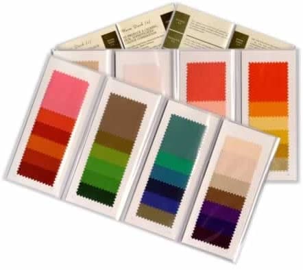
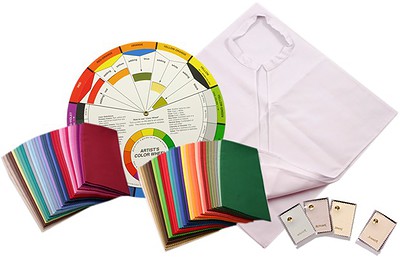
Here is a list of all the drapes and matching colour swatches we provide in our online catalogue of colour supplies at trade prices. On the final page, you will find this – a full explanation of the drape/swatch notations:
DRAPE NOTATIONS
Each drape is labelled with both Tonal and Seasonal directions. Every drape can be used for
seasonal analysis, tonal analysis, or both.
Each drape carries a label which shows the name of the hue, shade, tone or tint and its
number – the numbers are for ordering purposes only.
Each drape suggests which season could safely wear that colour:
- Spring
- Summer
- Autumn
- Winter
Each drape also suggests which tonal direction could safely wear that colour:
- LT = Light
- DK = Dark / Deep
- BT = Bright / Clear
- MT = Muted / Soft
- C = Cool
- WM = Warm
If you work with the tonal approach, you can use any of the drapes with that method. They are
all also marked with the seasons, so every drape can be used with any system at all.
Hopefully, this sets the scene so that I can start answering your questions…
Q1: Please may I know how a “bright/ dark” notation differs from “bright” and “dark” notation? That is, how is “BT/DK” different from “BT DK” with no “/” in between?
A1: There’s no difference at all. Probably just a typing error!
Q2: Also, how is “BT/DK” different from “DK/BT”? For example, salmon is denoted as “WM MT/DK DK/MT”. What is the logic of BT/DK being different from “DK/BT”?
BT/DK = Bright Dark
- Bright is the dominant tonal characteristic, and Dark is the secondary tonal characteristic
DK/BT = Dark Bright
- Dark is the dominant tonal characteristic, and Bright is the secondary tonal characteristic
Q3: In the Extended Seasonal analysis swatches, the “Cool Dark” is written as Cool/Winter, the “Dark/Bright” is written as “Dark Winter” and the “Bright/ Dark” as “Bright Winter”. Please may I know the name of the color analysis system this is taken from?

A3: The Extended Seasonal System (hence the name of these swatch wallets) started out as one of a number of new ‘tonal’ systems that were all the rage in the late Nineties.
New training companies were trying to set themselves apart by coming up with something different, an alternative to the seasonal system. Lots of these new ‘tonal’ systems were created purely for marketing purposes and, to be honest, most of them were beyond confusing.
If we couldn’t understand these new-fangled tonal systems, we hadn’t a cat in hell’s chance of explaining them to our clients!
So the majority of us who had been around since the early Eighties simply went back to using the seasonal system.
At the very least, every person across the globe learns about the 4 seasons – Spring, Summer, Autumn, and Winter – in early childhood.
The concept of 6 tones – Cool, Warm, Bright, Soft-muted, Deep, and Light – is not part of everyday life. So this is much more difficult to explain.
Eventually, I sat down with two other extremely experienced trainers to discuss the merits of tonal colour analysis and how, if possible, we could incorporate this into our already-established seasonal work.
We realised the solution was incredibly simple because
Seasonal and tonal are exactly the same thing
And this allowed us to produce the simplest colour analysis system on the planet:
- Either the dominant tonal characteristic has to be Cool or Warm
- Or the secondary tonal characteristic has to be Cool or Warm
So, using this approach, my system DOES NOT include any of these combinations:
- Dark and Bright
- Bright and Dark
- Dark and Soft-muted
- Soft-muted and Dark
- Light and Bright
- Bright and Light
- Light and Soft-muted
- Soft-muted and Light
My colour analysis training courses cover seasonal AND tonal, because they’re the same thing.
We use any of these combinations – in effect, a simpler version of the Extended Seasonal System:
- Cool and Bright
- Bright and Cool
- Cool and Soft-muted
- Soft-muted and Cool
- Warm and Bright
- Bright and Warm
- Warm and Soft-muted
- Soft-muted and Warm
- Cool and Deep
- Deep and Cool
- Warm and Deep
- Deep and Warm
- Cool and Light
- Light and Cool
- Warm and Light
- Light and Warm
There are a number of colour analysis systems out there these days, and the swatches and matching drapes in our online catalogue of colour supplies at trade prices are designed to support as many as possible.

NB. We don’t just supply drapes and swatches for the combinations/method I teach. We supply to other training companies and individual image consultants who may use different systems.
Q4: As a related point, for this notation, should “cool dark” not be dark winter instead of cool winter? And how is “dark winter” dark and bright, and “bright winter” bright and dark? I was under the impression that bright winter is medium in value and dark winter is medium in chroma.
Cool Dark
- Cool is the dominant tonal characteristic, and Dark is the secondary tonal characteristic
- Cool Dark = Cool Winter
- Dark Cool = Dark Winter
Bright Cool
- Bright is the dominant tonal characteristic, and Cool is the secondary tonal characteristic
- Bright Cool = Bright Winter
- Cool Bright = Cool Winter
As mentioned above, I don’t teach combinations such as ‘Dark Bright’ or ‘Bright Dark’.
In my system, either the dominant tonal characteristic or the secondary tonal characteristic has to be Cool or Warm.
Drapes and matching swatch wallets using ALL combinations are available in our online catalogue because we supply drapes and swatches to numerous training companies and their students across the globe, any or all of whom may use a different system from mine.
What do colour consultants actually NEED to know about colour?
From your questions, Ankburga, I can see that detail is very important to you, especially as you are an engineer, so let me also put this into context.
Different learning styles
When I came across the different learning modalities, i.e., VAK, I realised that consultants and their clients may all use different learning styles:
- For instance, I’m an auditory learner but most of my female clients are visual learners
- When I began to train consultants, I made sure to incorporate ALL the different learning methods in my training courses
I mention this because your learning style, as an engineer, will probably be completely different from mine! I just hope my way of answering your questions is proving useful!
I also realise that you may be looking at these notations for reasons other than becoming a colour consultant – I make no assumptions!
Different colour personality types
I work with, and teach, 4 colour personality types – Red, Blue, Green, and Yellow.
Colour psychology/personality typing is about how you CHOOSE to perceive and behave.
Each of the four colour personality types requires a different level of detail and understanding about colour. This applies to both consultant and clients.
As an engineer, you are most likely a Blue/Green colour personality type, asking lots of questions and requiring lots of detail in the answers.
To put this into perspective, I’m a Red personality type. I see the big picture and don’t look for the detail.
But because I understand what the 4 different colour personality types need, I can adapt the way I teach, coach, and respond to enquiries like this – to cater specifically for the client/enquirer.
Science/theory of colour
I learned all about value, chroma, etc. in the early Eighties when I trained. I found it extremely interesting but:
- I am not teaching colour theory
- I am teaching my students how to become a colour consultant
Consultants need to learn how to use colour so that they can help their clients look and feel fabulous on every occasion
- They don’t NEED to know about value, chroma, etc. to be able to do that
- They may WANT to know more about how colour ‘works’, but they don’t NEED to
For colour consultants, the science and theory of colour can be a distraction, especially for Green and Blue personality types who get caught up in the detail and may start giving their client the same amount of detail…
We all used to do this in the olden days.
The consultant who first analysed my colours in 1981 rattled on for England about colour theory, courtly fashion, etc.
Personally, I’m utterly fascinated by the history of fashion, clothes, colour, etc.. I could have listened to her all day and, since then, I have done extensive studies on the subject.
But that particular experience was a huge wake-up call for me as it was blatantly obvious (to me, anyway!) that the other ladies on the workshop were bored out of their brains!
The majority are only interested in WIIFM – ‘What’s in it for me?’
A colour consultation is always, always about the client.
What does the client want?
When a client is paying us for advice, we need to put aside what we might need or want to include.
So I encourage those who train with me to focus on what the client wants to achieve – the end result:
- the overall look
- what to wear
- what not to wear
- how to look and feel fabulous on every occasion.
I encourage consultants, and clients alike, to not get bogged down by detail.
What the client wants from any colour consultant is to know what to wear to look and feel confidently fabulous on every occasion.
Our clients are not coming to us for a colour theory session.
After all, there is no central body that legislates on the differences between a Spring, a Light Spring, a Warm Spring, and a Bright Spring (and all the other tonal/seasonal combinations) so…
The only person who can tell a colour consultant whether they’re right or wrong is the client!
Example:
If the Bright-est Spring on the planet walks in and she can only handle wearing Soft-muted Summer colours today (for whatever reason), then I need to get out of the way and show my client how to look and feel fabulous in Soft-muted Summer colours.
I will definitely be seeing this client again, so I can take her on a journey, at a pace that works for her, towards her best Bright Spring look – but only if SHE chooses to take that path.
I am a consultant, not a dictator, so the choice is always the client’s.
And most importantly, I take into account who the client is being and/or who they would prefer to be and how colour can help them do just that:
- There’s so much more to living, breathing human beings than simply the physical – what we can see
- So I include colour psychology/personality analysis in all my colour analysis training courses
All my training is franchise free, so my students can choose to use the content they like and ditch the rest.
Let me know if you have any other questions.
Further reading suggestions
